Undergraduate Admissions
Template How To
Using Beaver Builder
How to use Beaver Builder
Beaver Builder uses modules within rows and columns to build the content on your page. This site contains templated content to make design faster and more consistent, but you can explore other modules for when you need to add specific content too.
Begining with Templated Pages
Access templates > Saved Templates on the right (+) menu. You'll have several options to jumpstart page creation. From there add, delete, and/or edit content modules.

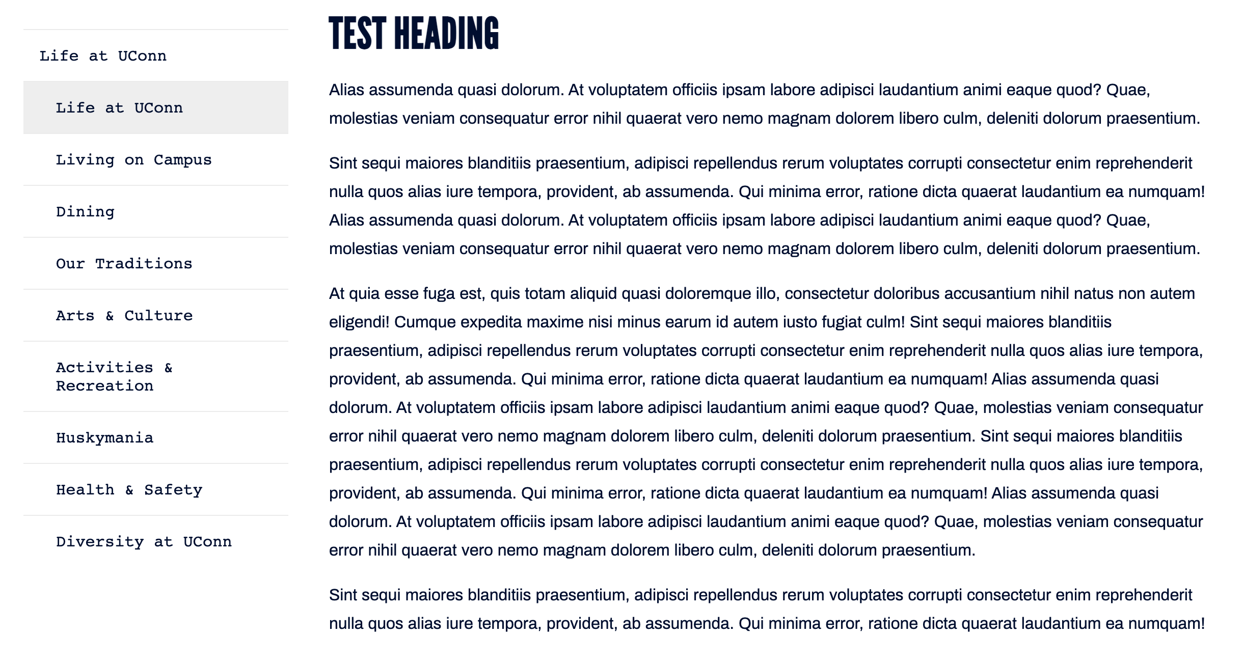
Photo Top Layout

Simple Text Layout

Saved Content
Accessing Saved Modules
Access via Saved on the right (+) menu. Saved content are separated by row, column, and modules.
Saved rows fall all a new row or line of content. They often have internal content (columns and modules) that are all packaged neatly in a single saved row. Saved columns are as named and can be added into larger rows, or alongside other columns and contain modules. Saved modules are a singular module with edited properties. Using this VS the modules section means less time editing content and more consistencies among said module.
To edit saved content, select the wrench icon that appears on rollover. Unless the content is global, this will only effect new content.

Saving content for reuse
 When editing a row, column, or module selecting Save As will begin the process to add to 'Saved' content. The content will be automatically sorted into its corresponding group.

After, you'll be prompted to name and choose whether global or not. Default is no.
Global modules are added multiple places but the content is the same and edited in one place. This is great for consistent side menus or content that would relay a singular message along many pages.
Saved Content List
Saved Modules
Grey Boxed Caption Text
Modified text module. Used for notifications and updates such as Covid-19 policies.
The University of Connecticut welcomes our new and returning students, faculty, and staff back to our campuses. In continuing our work with public health experts and our state to maintain a quality UConn educational experience while keeping our community healthy, we encourage prospective students and families to engage with our admissions office virtually. Virtual information sessions and one-on-one chats with an admissions officer are available to you daily. Visit reopen.uconn.edu for more information.
Photo Button
Best used in 3 columns. Can edit height properties to fit with a different column layout, but would recommend just using a 3 column layout.
Red Bordered Photo

Sidebar Nav Menu
Adjusts based on the page you're on and it's parent/child relationships. This is a Global module.
Sidebar Specific Nav Menu
Adjusts based on the page you're on and it's parent/child relationships. This is similar to the Global module version, but you can now choose a specific, precreated menu. It is NOT a global module.
Simple Button
Can add animation or icons. Set to auto, full-width, or custom to edit button size.
UC Callout Button Block
Photo with Overlay
Saved Rows
Photo used to save space.
Blue Background White Text
Thin CTA Bar - Grey

Photo Banner

Sidebar Row
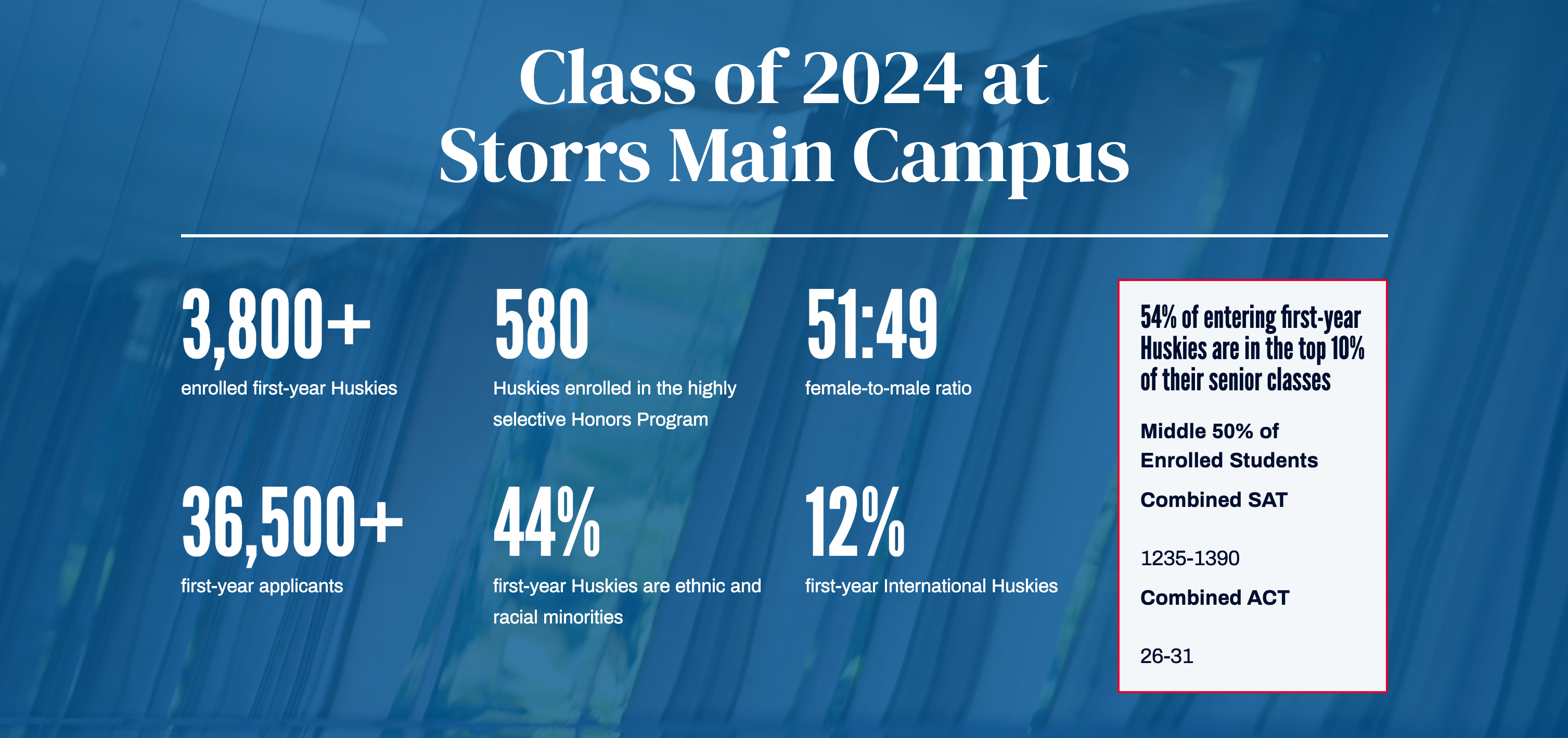
Stats Row
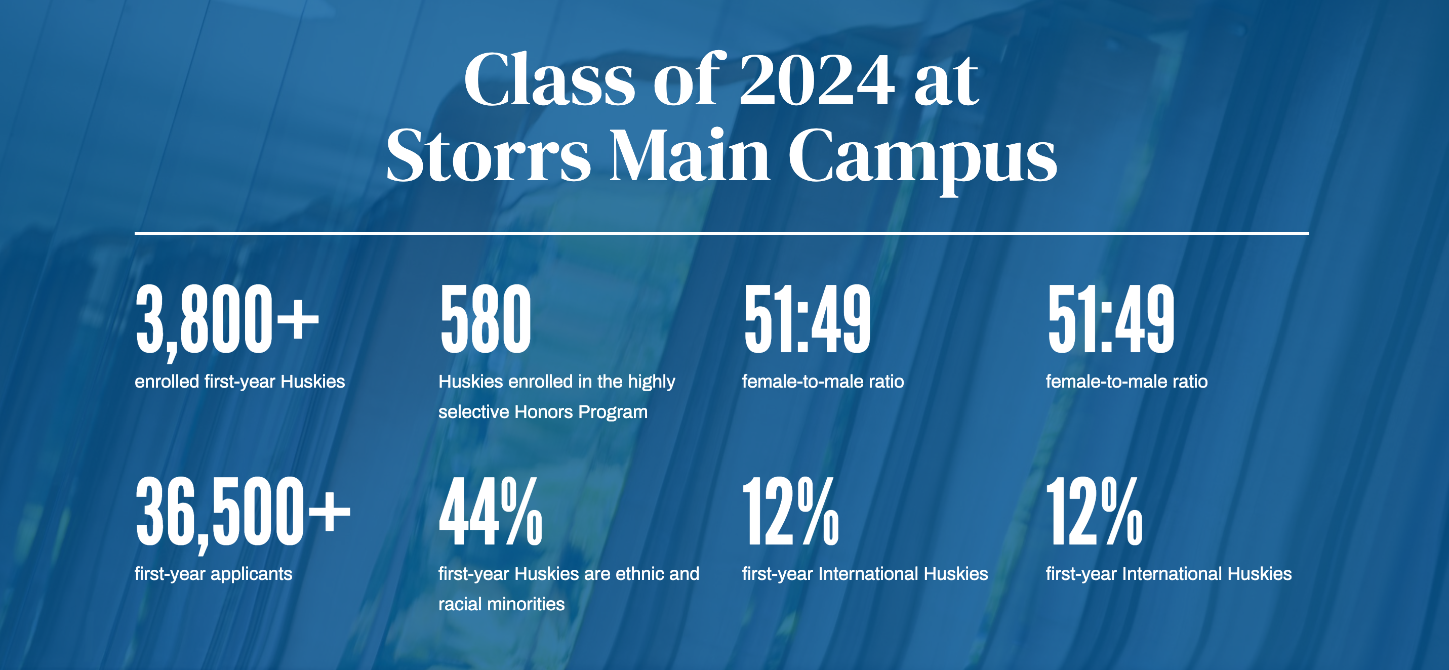
Stats Row - Right Informational Box
Saved Columns
Bordered 'Info' Section
Visit UConn
Transfer Fridays are designed to fit the unique needs of our prospective and admitted transfer students.
Icon and Text

Rigor
We verify whether you have completed our admission requirements and consider the range and challenge level of the courses you have taken each year
Slate Contact Form
[slate id="450bc751-6bf2-4218-977e-276f11293c4c" host="connect.uconn.edu"]
Typography
Utilities
In order to help keep consistent branding and make the theme easy to use, there are some utility classes you can use. Rather than adjust the color or font selection settings, you can use these CSS classes to keep things consistent. This way, if there are future updates to those classes, all modules that are affected will be changed automatically.
Color Reference
Blue 1
Blue 2
Blue 3
Red 3
Cool Grey 1
Cool Grey 2
Grey 1
Grey 2
Grey 3
Grey 6
Grey 7
Grey 8
Background Classes
Background classes allow you to quickly and easily change the background of modules. They take the form bg-colorName-number. For instance, this grey row has a class of bg-grey-1. That's it! Instead of changing the color settings for this row, you could change the class name. The current background classes are tied to the theme colors. If the theme colors ever change, the colors for those classes will as well. Currently these classes are:
- bg-blue-1
- bg-blue-2
- bg-blue-3
- bg-red-3
- bg-cool-grey-1
- bg-cool-grey-2
- bg-grey-1
- bg-grey-2
- bg-grey-3
- bg-grey-6
- bg-grey-7
- bg-grey-8
- bg-red-dot-parallax
- bg-red-dot-right-bottom
The two "red dot" classes will add the image of red dots to the row.

Text Classes
The following CSS text classes can be applied to rows, columns, and modules. They will change how the text content of appears.
- text-white (makes all text white)
- bodysans (makes all text use the Archivo/Proxima Nova font)
- displaysans (makes all text use the League Gothic font)
- displayserif (makes all text use the DM Serif font)
- monospace (makes all text use the Courier monospace font
Border Classes
The following CSS classes can be added to create a border around modules, columns, or rows. Please note there is a separate set of classes for image borders.
- border-red (currently around this text editor)
- border-white
- border-fix (adds a 20px margin around an item)
- image-border-red (adds a 2px border with padding around an image)
- image-border-white (adds a 2px border with padding around an image)

Icon Classes
The following classes can be added to icons.
- icon-blue-1
- icon-blue-2
- icon-blue-3
- icon-red-3
- icon-cool-grey-1
- icon-cool-grey-2
- icon-grey-1
- icon-grey-2
- icon-grey-3
- icon-grey-6
- icon-grey-7
- icon-grey-8
CSS Variables
If completely custom CSS is needed, you can use the following CSS variables. These are also tied to the theme colors and fonts. This way, if the colors/font values ever change, your custom CSS will change along with them.
- --max-width: 75rem (1200px)
- --blue-1
- --blue-2
- --blue-3
- --red-3
- --cool-grey-1
- --cool-grey-2
- --cool-grey-3
- --grey-1
- --grey-2
- --grey-3
- --grey-6
- --grey-7
- --grey-8
- --white
- --black
- --body-sans
- --monospace
- --display-sans
- --display-serif
Color example
div {
    background-color: var(--cool-grey-1);
    color: var(--blue-3);
    font-family: var(--monospace);
    max-width: var(--max-width);
}